|
|
|
|
|
|
|
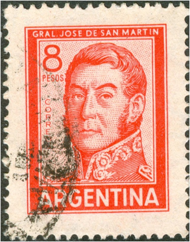
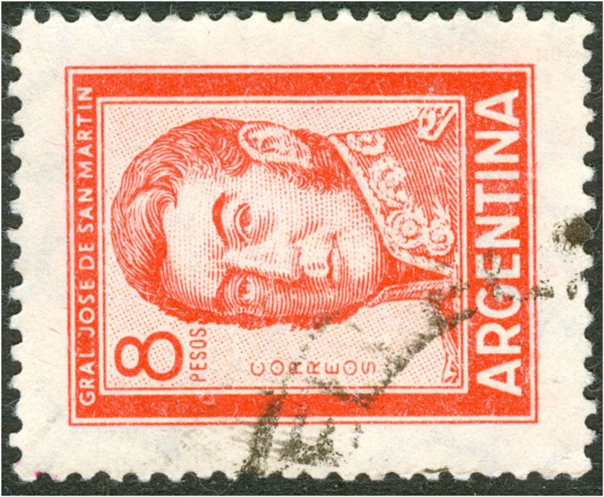
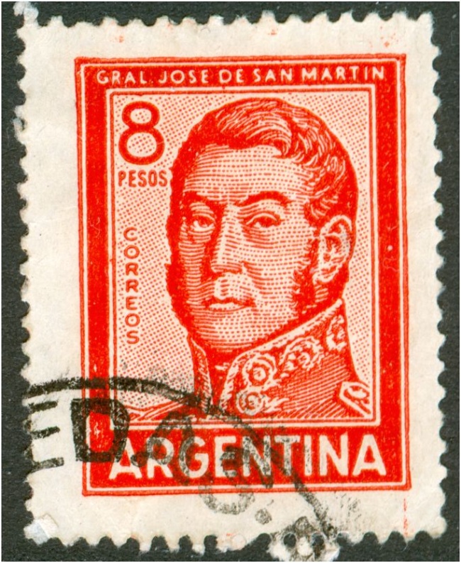
| Of the San Martin series the 2, 4, 8 and 10p are mentioned in the catalogue of mr. Tello Meggia having been printed both in offset-litho and in typography . Similarly the article of Mr. J. Holler on the PyR II+III. I was wondering whether I had overlooked something that involved the 20p. |
|
|
|
|
|
|
| Today I received the excellent book by mr. J.R. Merlo about the printing methods for postage stamps in general and for Argentinean stamps in particular. He shows a lot of stamps that exist both in offset-litho and in typography including the here mentioned series. But again no 20p |
|
|
|
|
|
|
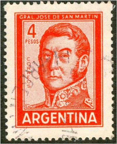
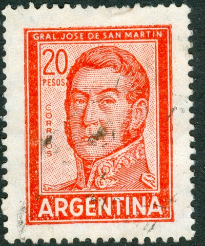
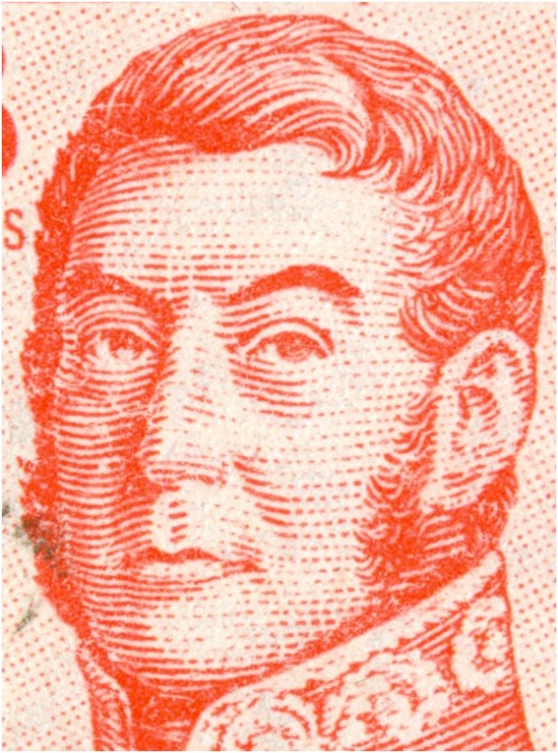
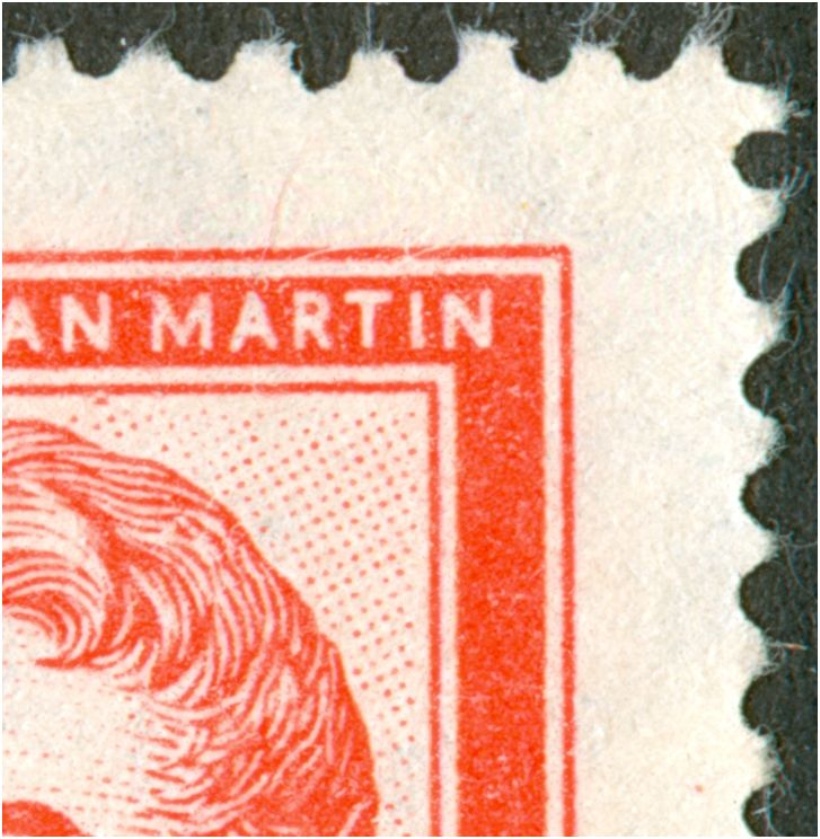
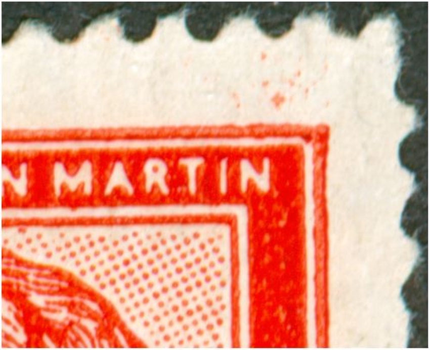
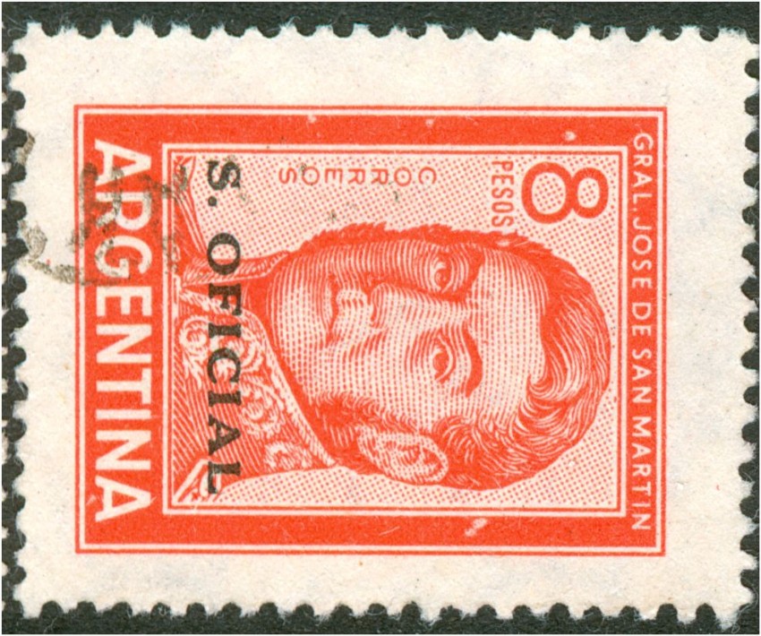
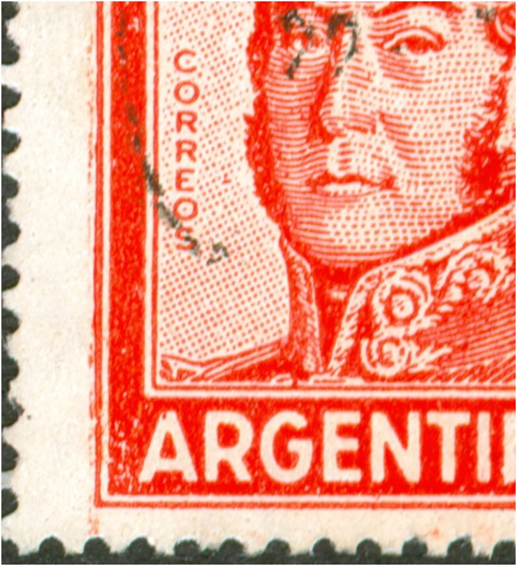
| The 20p Jose San Martin in offset-litho: |
|
|
|
|
|
|
 |
|
|
|
|
|
|
| details: |
|
|
|
|
|
|
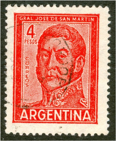
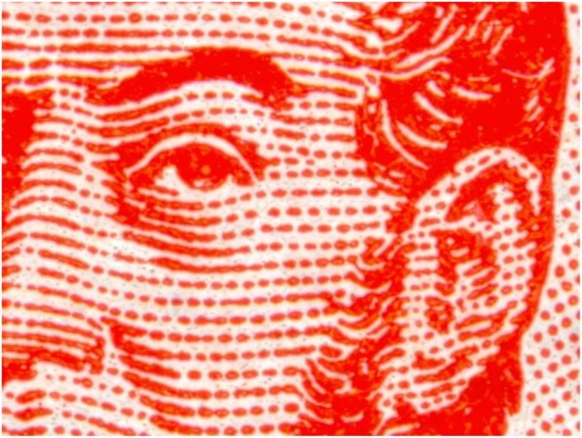
| offfset-litho: |
|
|
|
|
|
|
 |
|
|
|
|
|
|
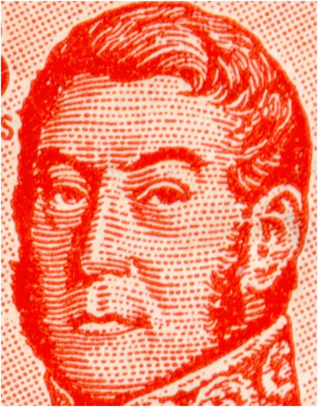
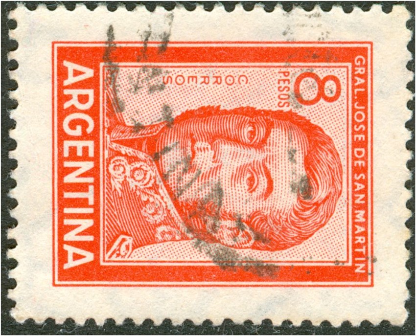
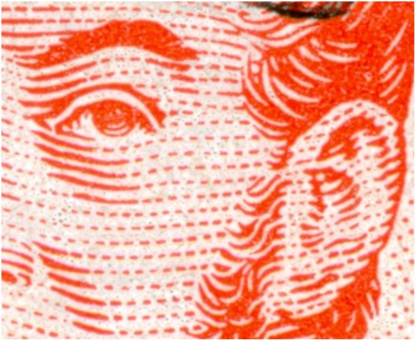
| typography: |
|
|
|
|
|
|
 |
|
|
|
|
|
|
| zeus25971 |
|
|
|
|
|
|
|
|
|
|
|
|
|
| Hi Mr Rein, I just checked out the 1974 specialized catalogue from Victor Kneitschel, and the secret is the S.Oficial Overprint. Seems like the original stamp was Tipographed while the overcharged one had been printed in offset. |
|
|
|
|
|
|
| Regards |
|
|
|
|
|
|
| Luis |
|
|
|
|
|
|
| Acabo de revisar el Knietschel 74, y el secreto esta en la sobrecarga S.Oficial. Aparentemente la estampilla original fue impresa en tipografia y la que tiene sobrecarga fue impresa en Offset. |
|
|
|
|
|
|
| Saludos |
|
|
|
|
|
|
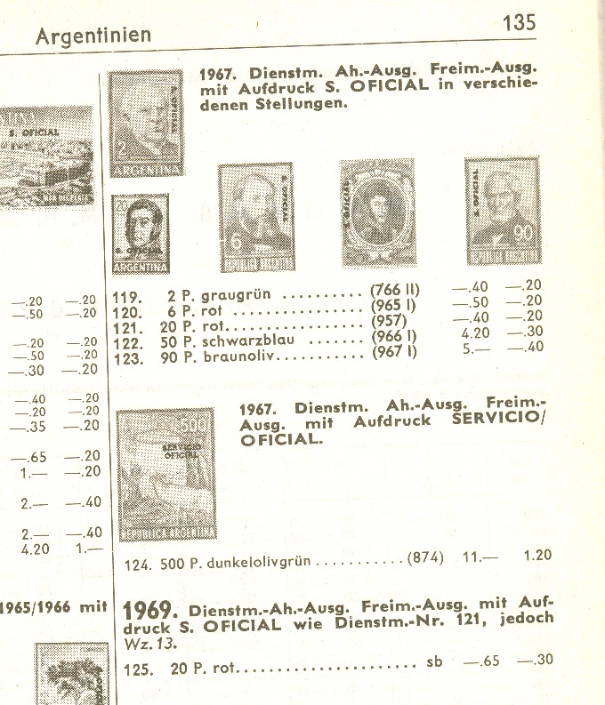
| Luis |
|
|
|
|
|
|
|
|
|
|
|
|
|
| Luis, |
|
|
|
|
|
|
| thanks that may be an explanation but not quite. Does the offset-litho version exist without "S.Oficial" ? Does the "S. Oficial" exist in both typography and offset-litho? |
|
|
|
|
|
|
| The latter question seems to have been answered by the German catalogue publisher Michel: |
|
|
|
|
|
|
 |
|
|
|
|
|
|
| whereas Tello Meggia only refers to a typography verrsion: |
|
|
|
|
|
|
 |
|
|
|
|
|
|
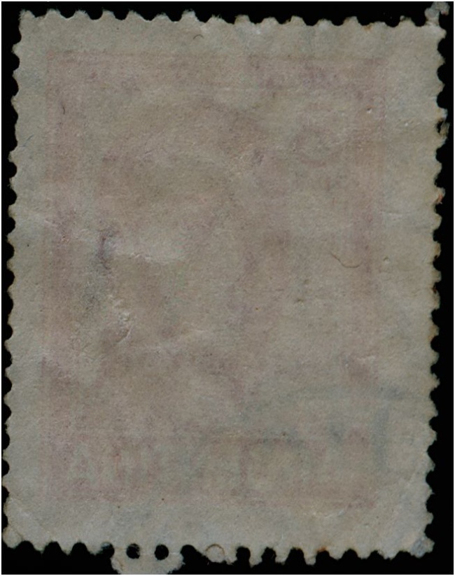
| The year Michel mentions - 1969 - does concur with the CDS (= circular date stamp) on my stamp. Michel also mentions the Casa de Moneda watermark (wz 13) whereas Tello Meggia only mentions a Sun+RA watermark |
|
|
|
|
|
|
| Getting a bit deeper in J. Merlo's excellent book, the first words he uses to describe the chapter on offset-litho vs typography is that the 20p JSM was the last one, in 1967, to be printed in typography. He could have mentioned the existence of the 20p in offset-litho at that point as the one issued in 1969 for the Servicio Oficial! Apparently he was not aware of that fact.... |
|
|
|
|
|
|
| In the same chapter, Merlo is referring to 2 types of typography machines, a flat-bed press - probably sheet-fed - and a reel-fed rotary. The visible differences between the 2 machines were beyond the scope of his book as Merlo admits ... |
|
|
|
|
|
|
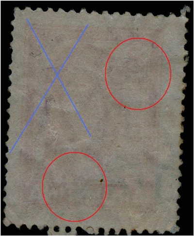
| Anyhow, we should be aware of both options and I think I have seen the effect of a rotary press on at least several stamps. For instance the 50c Puma that has been printed from cylinders that turned out to be mounted in 2 different positions - both with the axis of the cylinder vertically in relation to the stamp's design! Thus an ink flow occurred with a preference of either to the left or to the right. With an overdose of ink it could give birth to horizontal lines.... As what Luis Zeus was describing.... |
|
|
|
|
|
|
| hector78 |
|
|
|
|
|
|
| Rein es como vos decís. En la serie ordinaria se imprimió en tipografía únicamente en papel satinado Naciónal, siendo el último sello de Argentina en imprimirse por este método. En cambio en Servicio oficial se imprimió en offset y hay con filigrana sol redondo y con filigrana casa de la moneda. |
|
|
|
|
|
|
| Hector |
|
|
|
|
|
|
|
|
|
|
|
|
|
| Hector, |
|
|
|
|
|
|
| this 20p S.O. stamp is still special as it was printed in offset-litho on coated paper [tizado varioloso] - at least as far as the watermark multiple suns goes. I do not have that many copies so it may be scarcer than the catalogue prices suggest.... |
|
|
|
|
|
|
| GOOGLE: |
|
|
|
|
|
|
| Héctor, |
|
|
|
|
|
|
| este 20p S.O. sigue siendo el sello especial, ya que se imprimió en litografía offset en papel estucado [Tizado varioloso] - al menos en cuanto a la marca de agua de múltiples soles va. Yo no tengo que muchas copias por lo que puede ser más escaso que sugieren .... los precios de catálogo |
|
|
|
|
|
|
|