|
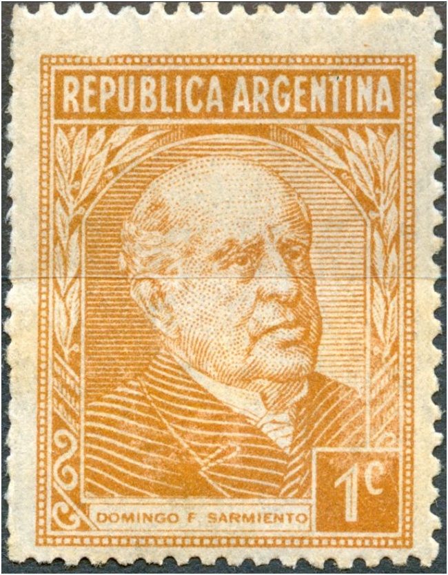
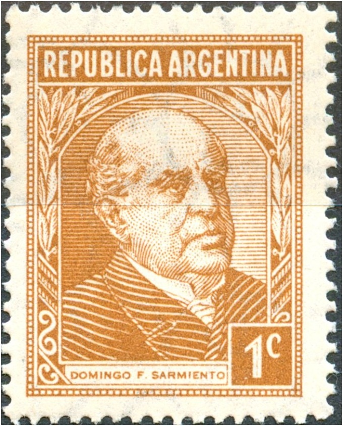
The various types we can find in the P&R I series starts off with the 1c D.F. Sarmiento in offset-litho and ends with the 20c Torito in offset-litho. What I shall not discuss now is the fact that the designs generally had got decreased measurements by the time the series progressed. It is however rather uncomfortable to measure heights and widths with some accuracy. Maybe if you take a better look we can come up with new types! Another way of approach is to continue describing the root blocks! Recognizing a particular stamp by the characteristics that belong to a particular root block confines the stamp to a particular [group of] printing(s). take as an example the 50c Petroleo with the dot behind "MAR"! |
|
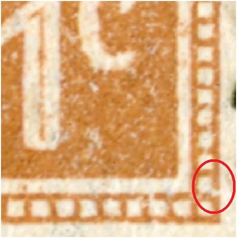
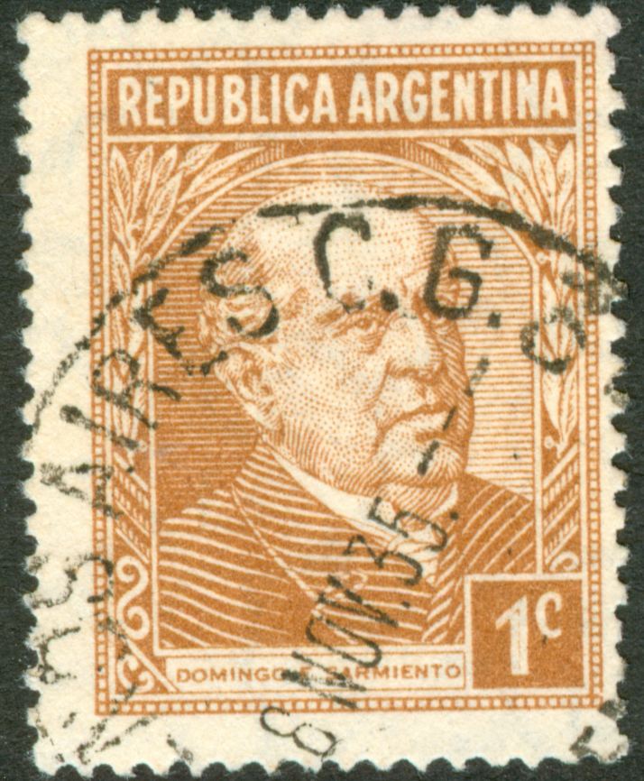
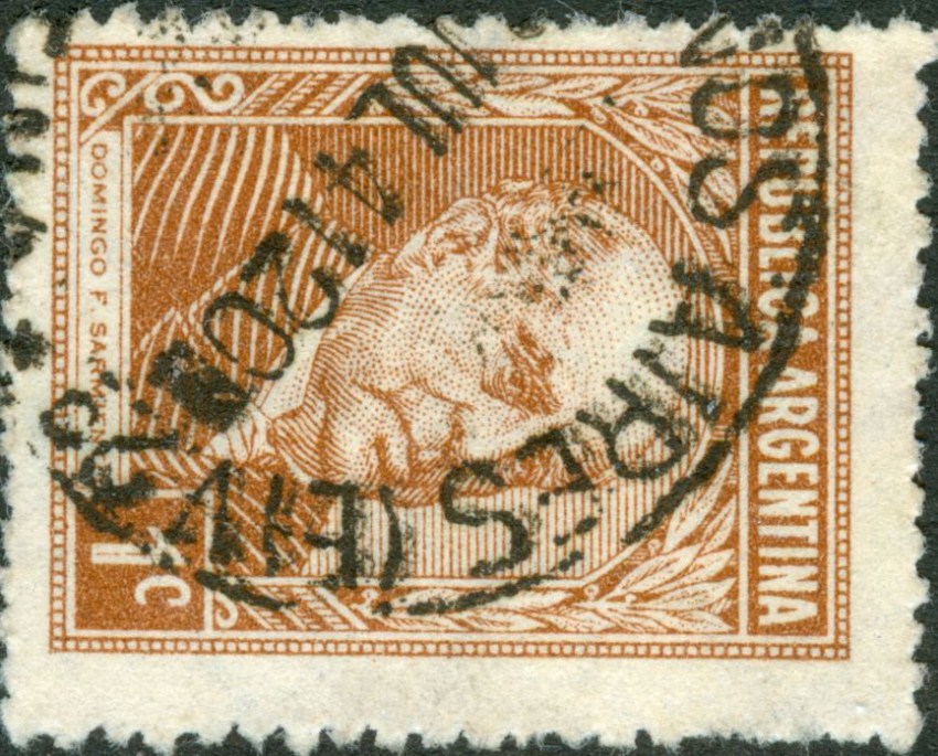
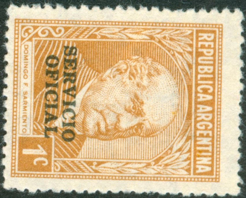
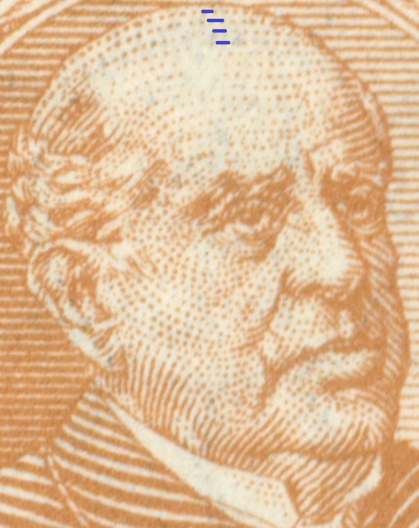
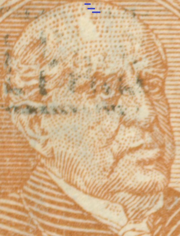
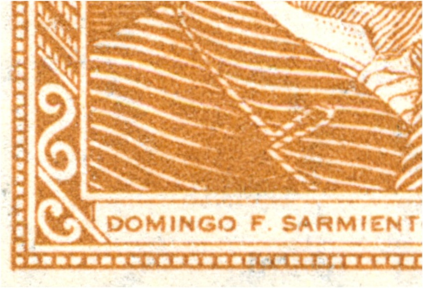
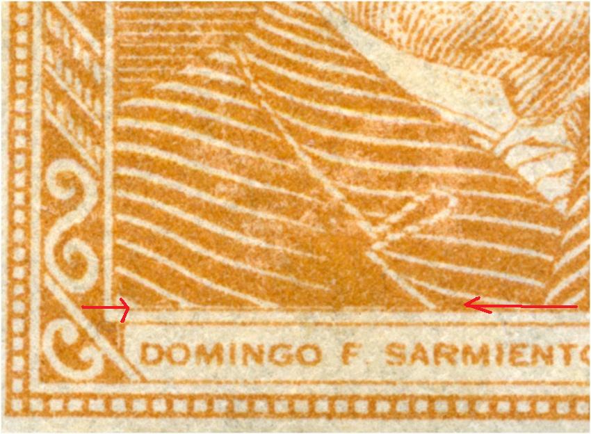
The 1c D.F. Sarmiento has 2 types when you look at the right bottom corner. Type I [is it really the oldest one??] has NO break, type II has a tiny break. A real First Day Cover might give evidence:
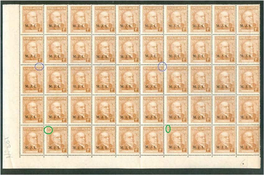
The root block here is 5x5 what we can tell by the characteristics in blue and green!
1st column, 8th row:
Same row but 5 columns to the right; 6th column, 8th row:
|
|
Quite early date of the 1c Sarmiento type II!
|
|
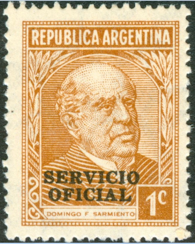
The Servicio Oficial on synmmetrical paper mesh and parallel watermark I have seen only in type I so far!
|
|
Remarkable that both types occur in the 1940 printings on Dutch paper - symmetrical paper mesh, orthogonal watermark! type I:
|
|
type II:
|
|
Remarkable that both types occur in the 1940 printings on Dutch paper - symmetrical paper mesh, orthogonal watermark! But with the Servicio Oficial so far only: type II:
|
|
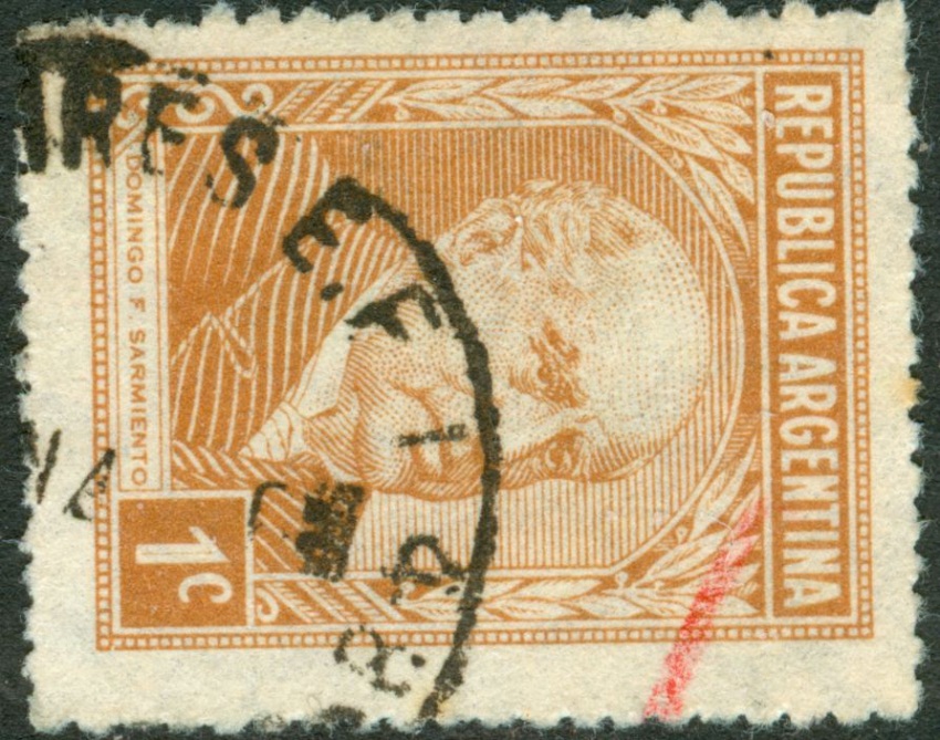
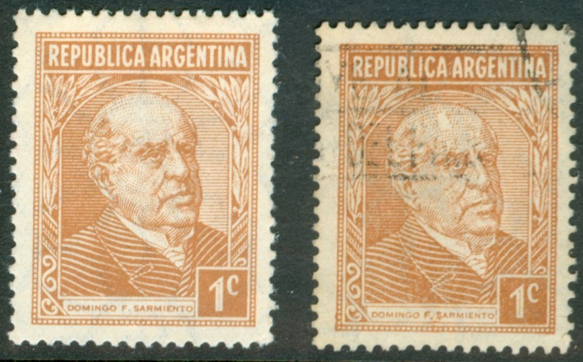
The two types of the 1c D.F. Sarmiento are clearly visible in the offset-litho versions. The difference between the first offset-litho and the typography version is mainly the general difference between offset-litho and typography. Still you may see some parts that slightly differ:
the offset-litho has a very egally spread ink and the edges are clean; the typography has edges that uneven especially in the corners! The empty forehead in offset-litho:
The empty forehead in typography is more pronounced:
|
|
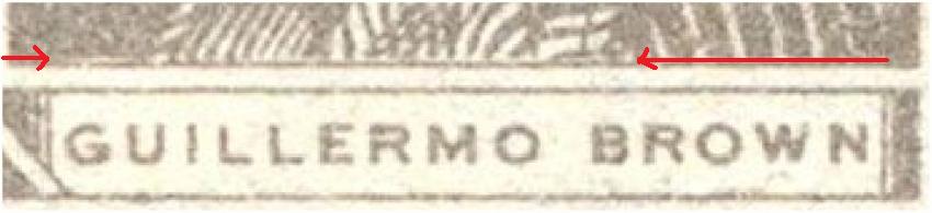
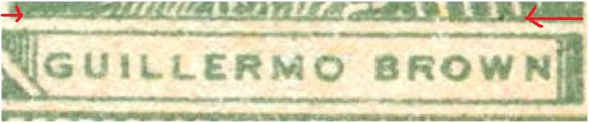
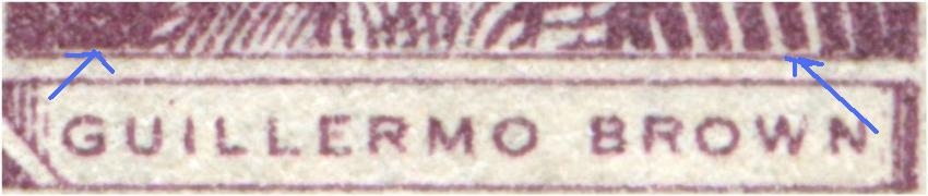
There is yet another way to split up the 1c D.F. Sarmiento according to types, like we can do with the G. Brown "stamps
The other type does not have this interval:
Both do NOT have the break in the frame! |
|
There seems to be some system in it , at least this goes for the Guillermo Brown definitives, 4c grey and green and also the 20c:
The 1c D.F. Sarmiento:
|
|
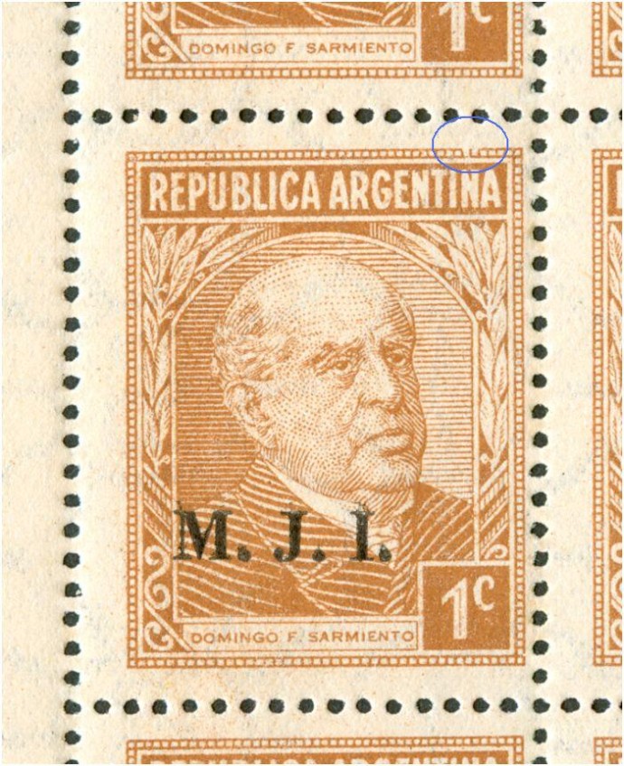
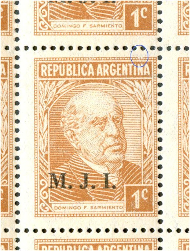
"zeus25971 02 Apr 2009 22:04" Dear Rein, I have some "half plates" of 1c Sarmiento and seems like the curiosity you mention above are in some positions of the plate. It would be great if someone else has plates of any of the seals you mention could verify if this repeats on every plates (in the 2 half plates I have there are some stamps that has the errors). In the next days I will take a deeper look at it and I will document the exact place in which this curiosity arises. Best Regards Luis Tengo 2 medias planchas del 1c. SArmiento y pareceria ser que la curiosidad qu mencionas mas arriba estan en ciertas posiciones de la plancha. Estaria bueno si alguien mas posee planchas o recortes grandes que mencionas se riepute en todas las planchas ( en las dos medias polanchas que tengo, algunos sellos tienen los errores). En los proximos dias, estudiare en detalle las posiciones de plancha y lo documentare aqui. De paso les pido a los que pudieran tener planchas que la tengan a mano a ver si podemos verificar que realmente sea repetitivo y podamos incluirlo como variedad. La mejor manera de adelantarse al futuro, es inventarlo. So at least it seems a rather constant flaw or may be we should stil call it a "type"?! Just like the 20c G. Brown! We have to find out whether it occurred from the very beginning till the end of the 1c being printed or just somewhere in the middle... |
|
In considering the 20c Guillermo Brown as part of the P&R I series I apparently stand alone as most philatelists and catalogue makers prefer to incorporate it in the P&R II/III set! This is very strange as the design perfectly matches and that can NOT be said of the 5c José de San Martin (1945) not of the 35c Post Office (1942)! "Otin 29 May 2010 00:21" Rein, El 20c Brown violeta no puede ni debe ser incluido en PyR 1 por el sólo hecho de parecerse al diseo de esa serie. Tampoco el 5c Hernández. Los sellos de PyR I fueron emitidos en virtud de un decreto y otros que ordenaron las modificaciones, cambios de colores y valores complementarios (35c, 5c JSM rojo, 3c Moreno gris) etc. Los mencionados Brown y Hernández pertenecen a decretos aparecidos varios aos después, como valores de las series ordinarias en curso. Debe tenerse en cuenta que los decretos ordenan la emisión de determinados valores pero no indican cuál debe ser la vieta. Esta es elegida por el Correo en combinación con la Casa de Moneda. Doy un ejemplo: el 5 pesos Cataratas del Iguazú, verde, grabado, fue emitido por el Dto. N 17043 del 14/9/53 y puesto en circulación el 1/12/55. Salió en papel tizado importado. En fecha 31/7/56 con Dto. N 13.389 se ordena emitir 22 nuevos valores de los cuales se imprimen sólo 11. En este decreto se incluye el 5c Hernández y el 20c Brown, que se ponen en circulación en las siguientes fechas: 28/10/57 y el 30/11/56 el Brown tipo I y el tipo II el 25/7/57. En papel rayado (gaufré) sale en 1958. Dicho decreto ordena también un valor de 5 pesos. Qué hizo la Casa de Moneda? Usó las planchas grabadas de 1955 que ya tenía y sacó el viejo 5p pero en papel MATE! Para su conocimiento y para quienes esto lean, después de PyR I no vienen la II ni la iii. Para ser más claro al respecto: los sellos ordinarios emitidos en pesos moneda nacional hasta 1970 no pertenecen a un decreto que haya ordenado la serie II ni la III, sino que pertenece varios decretos que iban ajustando las tarifas a medida que la inflacióniba in crescendo. Como diríanlos ingleses. as a matter of fact (como un asunto de hecho) los decretos son 11, que van desde 1953 hasta 1967, o sea que si queremos ser precisos, y así debe ser, los valores de cada decreto constituyen una serie en sí misma y así debieran estar catalogadas. A título de curiosidad doy un dato: el sello de 300 pesos está incluido en el decreto anterior pero no se imprimió. Apareció recién el 5/2/62 con la vieta Mar del Plata porque así lo estableció el Dta. N 6242 del 28/7/61 en el papel tizado con sol redondo y con sol ovalado. Un nuevo decreto N 8595 del 24/8/62 ordena otra vez el 300p y la Casa de Moneda lo vcuelve a imprimir pero en papel tizado nacional. Ven Uds. que un mismo sello, pero con papel cambiado, pertenece a distintas series, o decretos si lo prefieren. Rein: I hope Google will take care of the translation. Buenas noches! Merlo The 20c G. Brown nor the 5c J. Hernandez had been mentioned in official modifications of the P&R I series. On the contrary, they have been explicitly mentioned - by the Post Office - in the same Decree dated 31/7/56 N 13.389 as 22 stamps to be part of the so-called P&R II set! On formal grounds José Merlo has it right, but otherwise there is every reason to include these stamps! Both the 20c and the 5c :D |