|
|
All 5 c. M. Moreno with an orthogonal watermark, symmetrical paper wire and the line of AЯ parallel to the short side of the stamp, but the direction of paper in all cases parallel with the long side of the stamp "M" *: * N.B. my notation is different from that of mr Bardi as he only takes into account the line of AЯ, I am not interested in the first place in that as I want to establish the orientation of the paper first! So at least I can deal with stamps that have no watermark or the CdM.... |
Todos 5 c. M. Moreno con una marca de agua ortogonales, alambre de papel simétrico y la línea del paralelo AЯ el lado corto del sello, pero la dirección del documento en todos los casos en paralelo con la parte larga de la marca "M" *: * Nota: mi notación es diferente de la de Señor Bardi como él sólo tiene en cuenta la línea de AЯ, no me interesa en primer lugar en el que, como yo quiero establecer la orientación del primer artículo! Así que por lo menos que puedo lidiar con sellos que no tienen marca de agua o de la CdM .... |
|
|
|
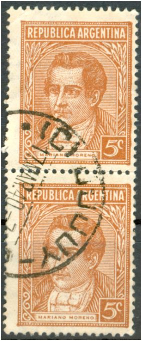
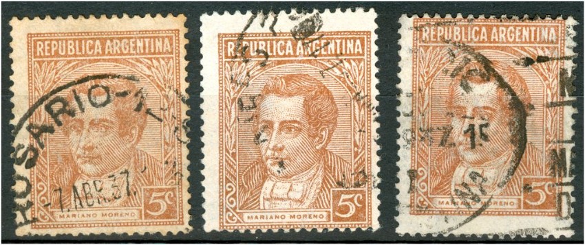
How come that philatelists can spend hours on searching for catalogue numbers like Pt 124Xa or Kn 453Y without seeing what is already in their album??? I have published the different types of the 10c Rivadavia in typography here a few months ago - stamps undiscovered for decennia. Today I found out that the 5c Mariano Moreno in typography has had 2 types of which the 2nd probably showed up for the first time in 1939. It is a tiny detail in a stamp that everyone will find in their collection! Nothing rare probably! |
Cómo es que los filatelistas pueden pasar horas en la búsqueda de números de catálogo como PT 124Xa o Kn 453Y sin ver lo que ya está en su álbum??? He publicado los diferentes tipos de la 10c Rivadavia en la tipografía aquí hace unos meses - sellos para descubrir decennia. Hoy me enteré de que la 5C Mariano Moreno en la tipografía ha tenido 2 tipos de los cuales el 2 probablemente se presentó por primera vez en 1939. Es un pequeño detalle en un sello que todo el mundo se encuentra en su colección! Nada raro, probablemente! |
|
|
|
Reading the article of Leopoldo Tenorio Casal, we find a reference to a first production of coated paper for the 5c Moreno and the 10c Rivadavia of 1939; a 3rd production however for the 1943 printing on coated paper for the 1c DF Sarmiento, the 5c Moreno and the 10c Rivadavia. |
Leyendo el artículo de Leopoldo Tenorio Casal, nos encontramos con una referencia a una primera producción de papel estucado para la 5c Moreno y el 10c Rivadavia de 1939, una tercera producción sin embargo, para la impresión de la de 1943, sobre papel tizado para la 1c DF Sarmiento, el 5c Moreno y el 10c Rivadavia. |
| :
1c, third production:
5c, 1st and 3rd production:
10c, 1st and 3rd production:
Where is the 2nd production!??? Dónde está la segunda producción??? I suggested the - Entonces, la segunda producción:
1941 19.10 Julio A. Roca with an orthogonal watermark, symmetrical paper mesh, coating and/or varnish, in photogravure - 1941 19.10 Julio A. Roca con una marca de agua ortogonales, de malla de papel simétrico, de recubrimiento y / o barniz, en huecograbado to be our second production! But have a close look at the J. Roca stamp ...Pero un vistazo de cerca el sello de J. la Roca ... It does not look much like the 5c we have of 1941... Is the 1941 printing still on the paper of the 1st production? - No se parece mucho a la 5c tenemos de 1941 ... Es el 1941 de impresión aún en el papel de la primera producción? |
|
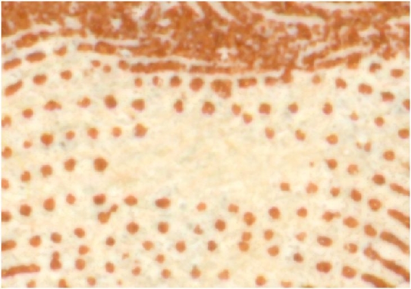
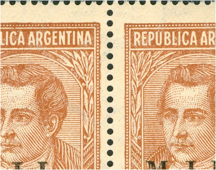
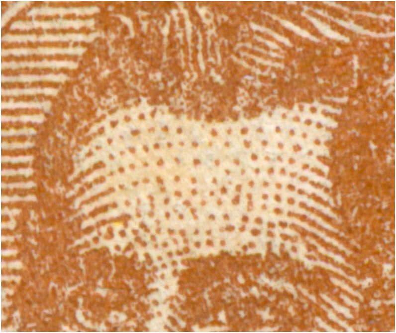
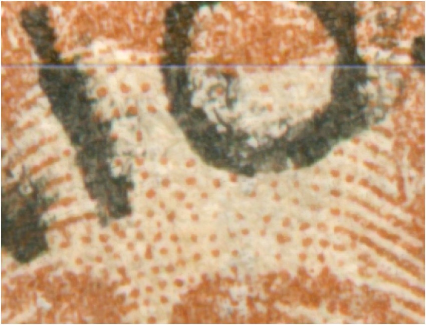
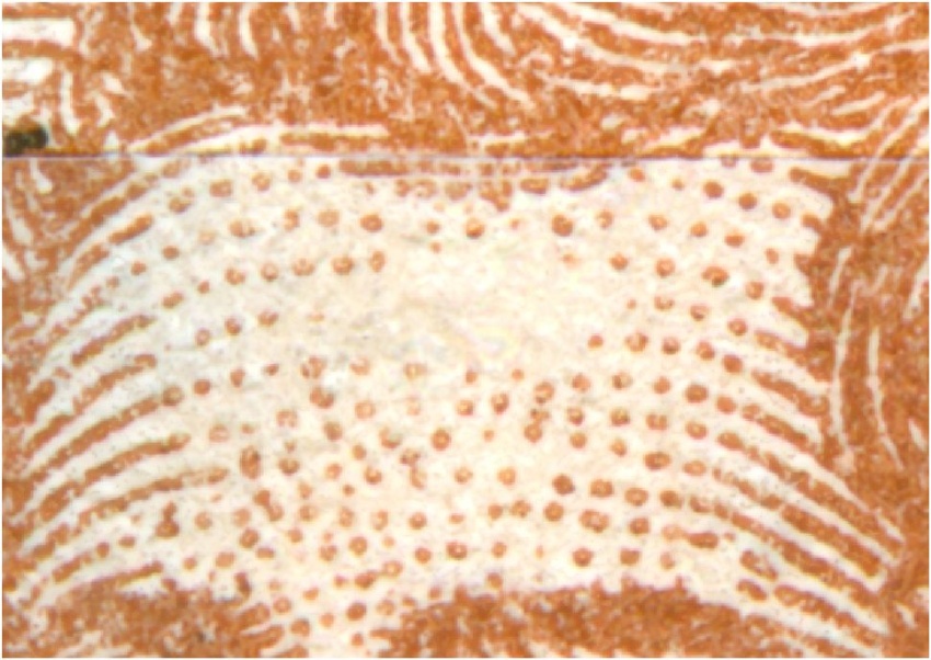
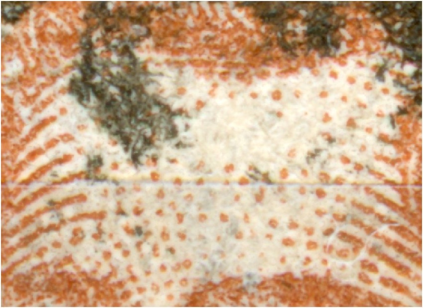
A further study revealed the subdvision of type II, both on coated paper with an orthogonal watermark, paper mesh gauge 30/16: |
Un estudio reveló además la subdvision de tipo II, tanto en papel recubierto con una marca de agua ortogonales, calibradores de malla de papel 30/16: |
|
|
|
Two month ago I posted - Hace dos meses me envió: How come that philatelists can spend hours on searching for catalogue numbers like Pt 124Xa or Kn 453Y without seeing what is already in their album??? I have published the different types of the 10c Rivadavia in typography here a few months ago - stamps undiscovered for decennia. Today I found out that the 5c Mariano Moreno in typography has had 2 types of which the 2nd probably showed up for the first time in 1939. It is a tiny detail in a stamp that everyone will find in their collection! Nothing rare probably! and now I come across a 3rd type of the 5c Moreno in typography! |
Cómo es que los filatelistas pueden pasar horas en la búsqueda de números de catálogo como PT 124Xa o Kn 453Y sin ver lo que ya está en su álbum??? He publicado los diferentes tipos de la 10c Rivadavia en la tipografía aquí hace unos meses - sellos para descubrir decennia. Hoy me enteré de que la 5C Mariano Moreno en la tipografía ha tenido 2 tipos de los cuales el 2 probablemente se presentó por primera vez en 1939. Es un pequeño detalle en un sello que todo el mundo se encuentra en su colección! Nada raro, probablemente! y ahora me encuentro con una 3 tipo de Moreno la 5c en tipografía! |
|
|
|
all ascending - todos ascendente : |
|
all ascending - todos ascendente : |
|
all ascending - todos ascendente : |
|
all ascending - todos ascendente : |
|
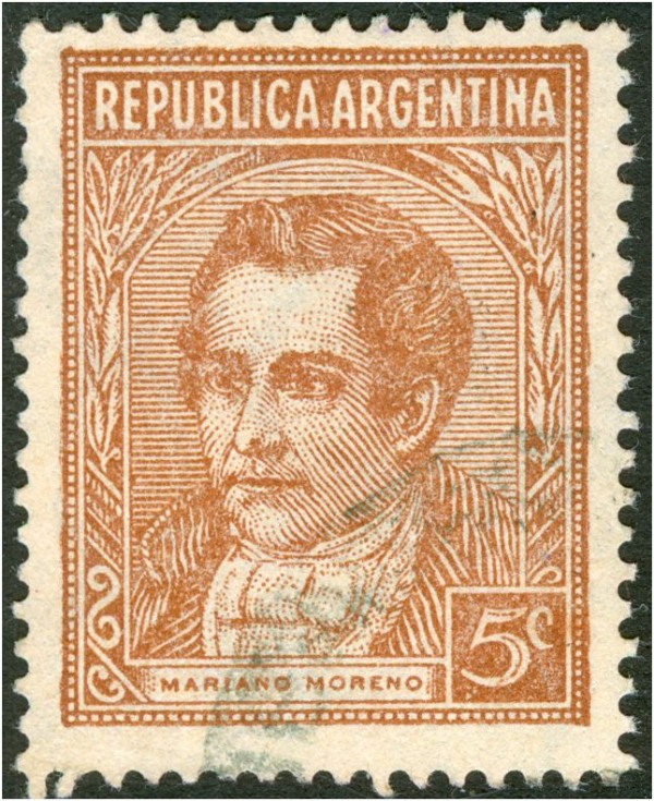
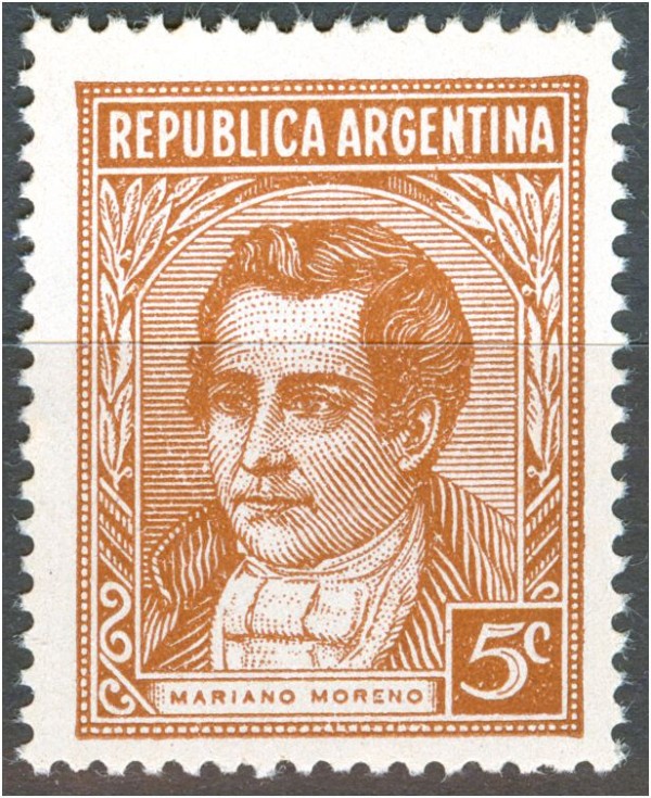
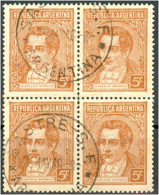
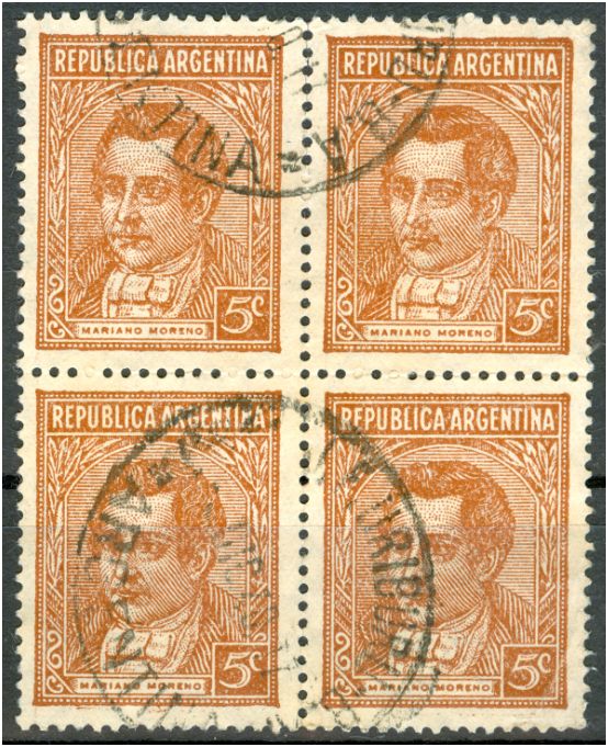
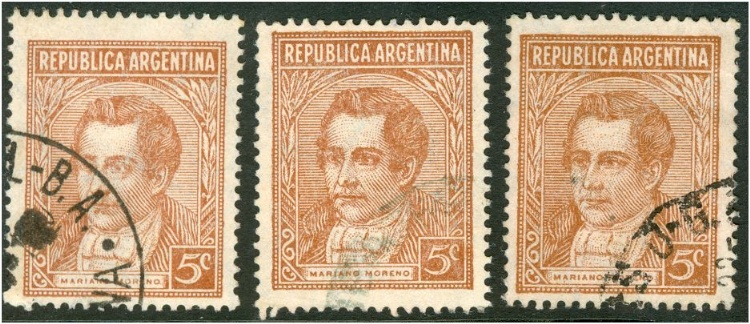
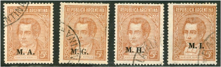
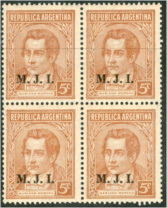
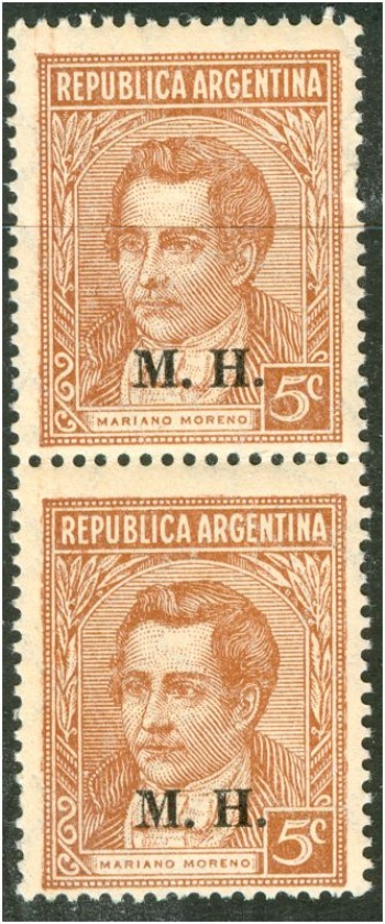
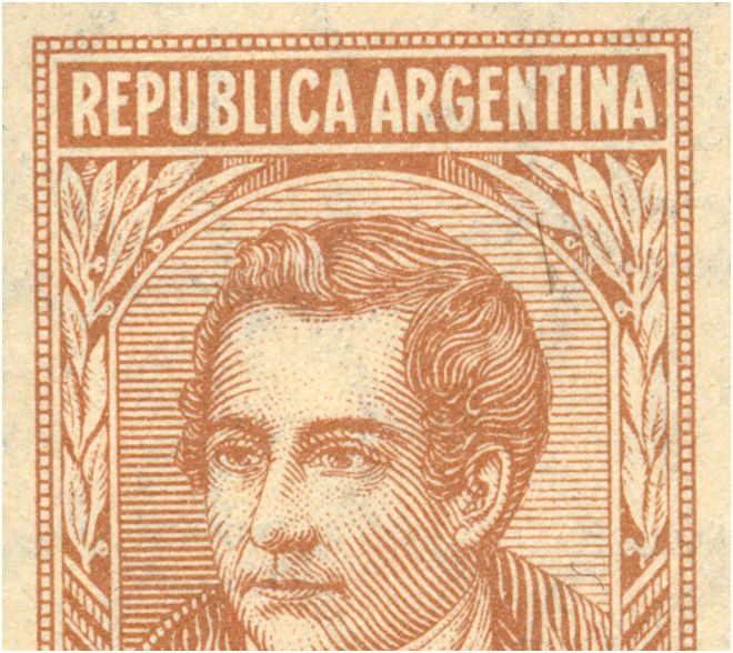
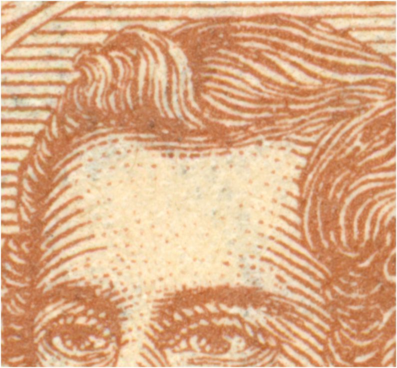
Some may react - what the fuzz?! - the empty forehead is THE difference between the offset-litho version and the typography version of the 5c Moreno! They seemed to be right up to now! The only problem is that everybody might have known it, nobody had bothered to write it down and publish it let alone enlist it in any catalogue ..... A typical lethargy or tunnel vision?? It may as well be that the first version of the 5c Mariano Moreno had an empty forehead and as such had been used for the 5c offset-litho from the very start in 1935; and that the first typography version had basically the same design - bare forehead - but got changed pretty soon afterwards... |
Algunos pueden reaccionar - lo que la pelusa?! - La frente vacía es la diferencia entre la versión en offset y la versión de la tipografía de la 5c Moreno! Parecía que hasta ahora! El único problema es que todo el mundo podría haber sabido, nadie se había molestado en escribirlo y publicarlo por no hablar de conseguir en cualquier catálogo de ..... Un letargo típico o visión de túnel?? Bien podría ser que la primera versión de la 5c Mariano Moreno tuvo un frente vacío y, como tal, se había utilizado para la 5c litografía offset desde el comienzo en 1935, y que la primera versión de la tipografía había básicamente el mismo diseño - desnuda la frente -, pero se cambió poco tiempo después ... |
|
offset-litho with empty forehead - offset con la frente vacía:
typography with empty forehead - la tipografía con la frente vacía:
pointed forehead in typography - frente, señaló en la tipografía:
|
|
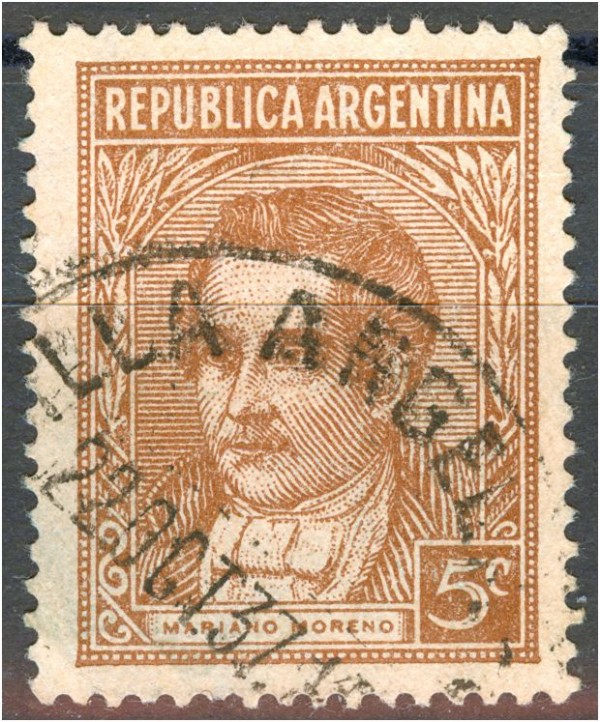
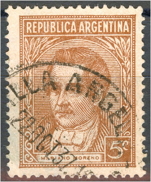
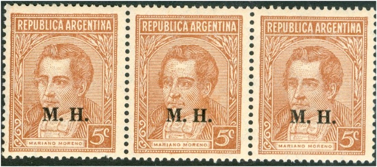
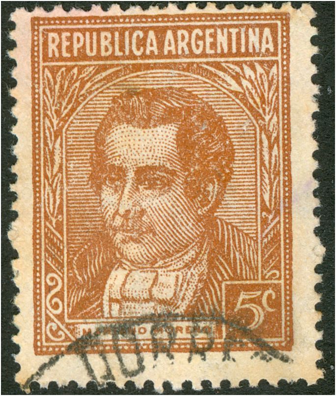
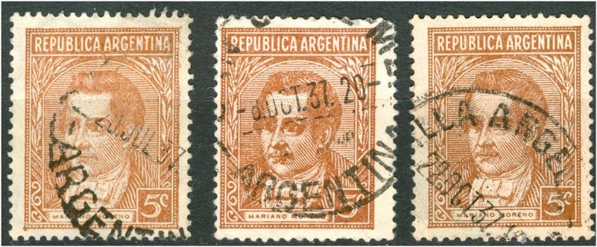
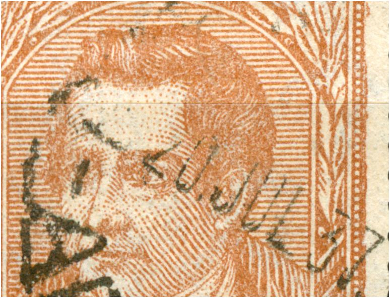
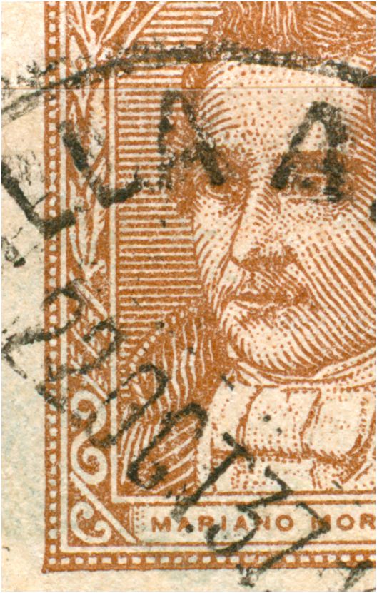
The 5c Mariano Moreno in typography was issued on 19.03.1937 and printed on normal, uncoated paper; see Leopoldo Tenorio Casal: 5c Tercero y ultima valor de fotograbado estereotipado, por su uso, es el que más variedades tiene, se inicío el 19 de marzo de 1937, sobre papel común filigranado Sol R.A. 9 1\2 mm. de diámetro, distancia de los soles entre si 29,5 x 17,75, posicíon de filigrana horizontal, lo que debe tenerse en cuenta para su independizacíon, hay doce impresíones. typography with empty forehead - la tipografía con la frente vacía:
7th of April, 1937 is rather early! - 7 de abril 1937 es más bien temprano!
|
|
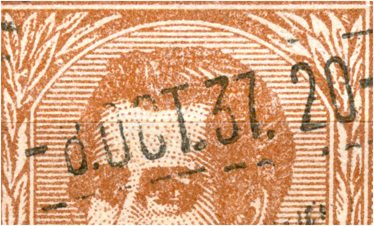
The 5c Mariano Moreno in typography was issued on 19.03.1937 and printed in typography with empty forehead. Still in the same year the 2nd type had been used with the pointed forehead - El 5c Mariano Moreno en la tipografía se publicó el 19\03\1937 e impreso en tipografía con la frente vacía. Aún en el mismo año el 2 tipo se había utilizado con la frente, señaló. 20th of July, 1937 is rather early! 20 de julio 1937 es más bien temprano!
|